Display

The Importance of Cinematography in Marketing Campaigns
We not only do marketing, we teach it too. Want to learn how our top tier marketer's learn? Keep Scrolling.
The Importance of Cinematography in Marketing Campaigns

Designing for Connection: How to Engage Your Audience through Graphic Design

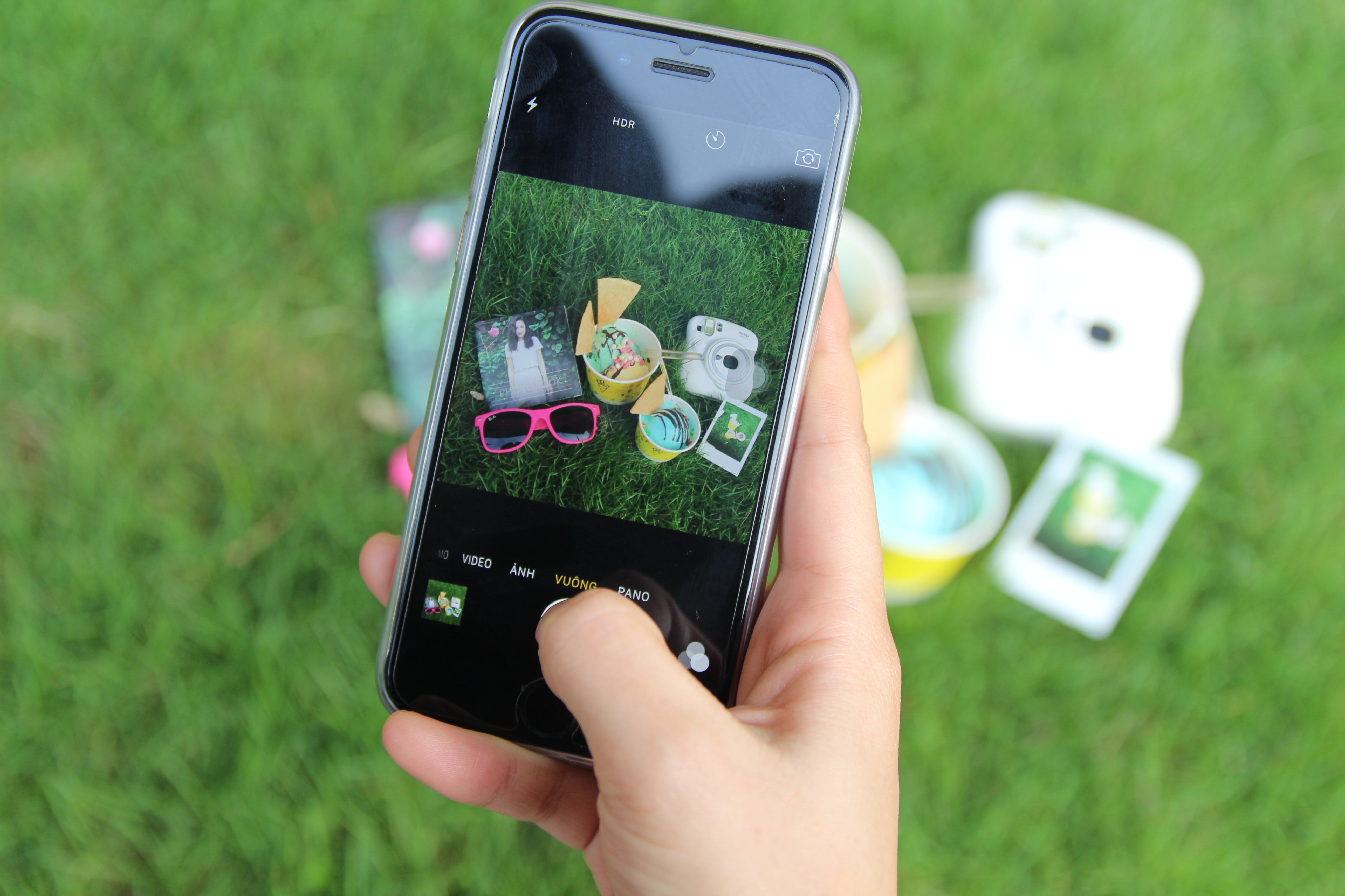
Pin It to Win It: Crafting Effective Pinterest Posts to Grow Your Following

The Marketing Hero’s Journey: How to Use the Hero’s Journey Narrative Framework to Craft Compelling Brand Stories

Unlocking Your Creativity: How to Get Inspired When Your Marketing Strategy Falls Flat
The Power of Negative Space in Marketing: How to Use Less to Achieve More

Marketing Mood: How Your Emotions Can Impact the Success of Your Marketing Strategy

Dream Big: How to Harness the Power of Your Dreams to Fuel Your Marketing Strategy

Cultural Connection: Why Understanding Culture is Key to Effective Targeted Marketing
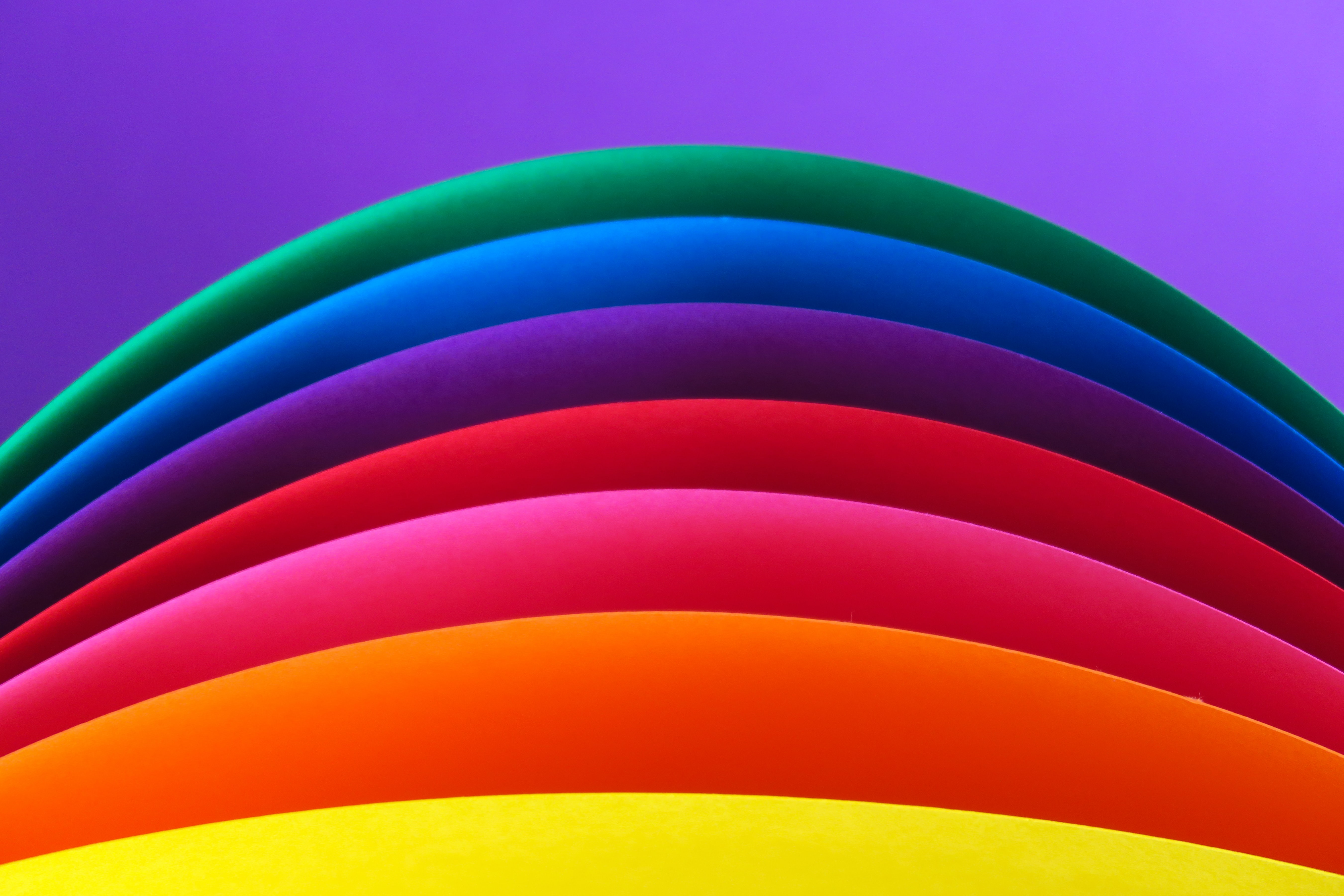
The Psychology of Color in marketing: How Color Choice Impacts the Mood of Your Target Audience

The Power of Primary Colors in Marketing: How Red, Blue, and Yellow Can Impact Your Strategy
Going Beyond Primary: How Secondary Colors Can Elevate Your Marketing Strategy
Chilling Effect: How Cool Color Tones Can Impact Your Marketing Strategy

Warm Welcome: How Warm Color Tones Can Elevate Your Marketing Strategy

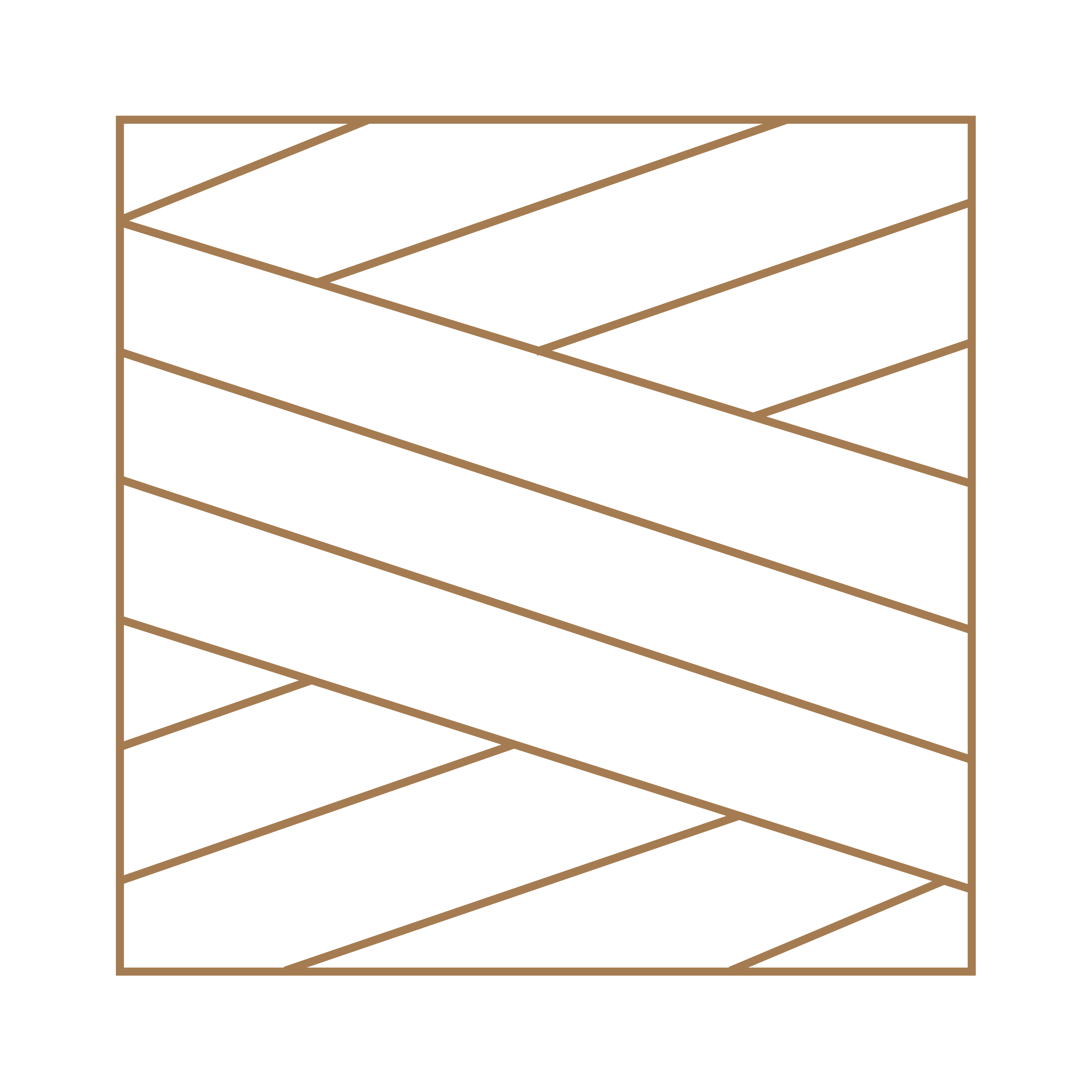
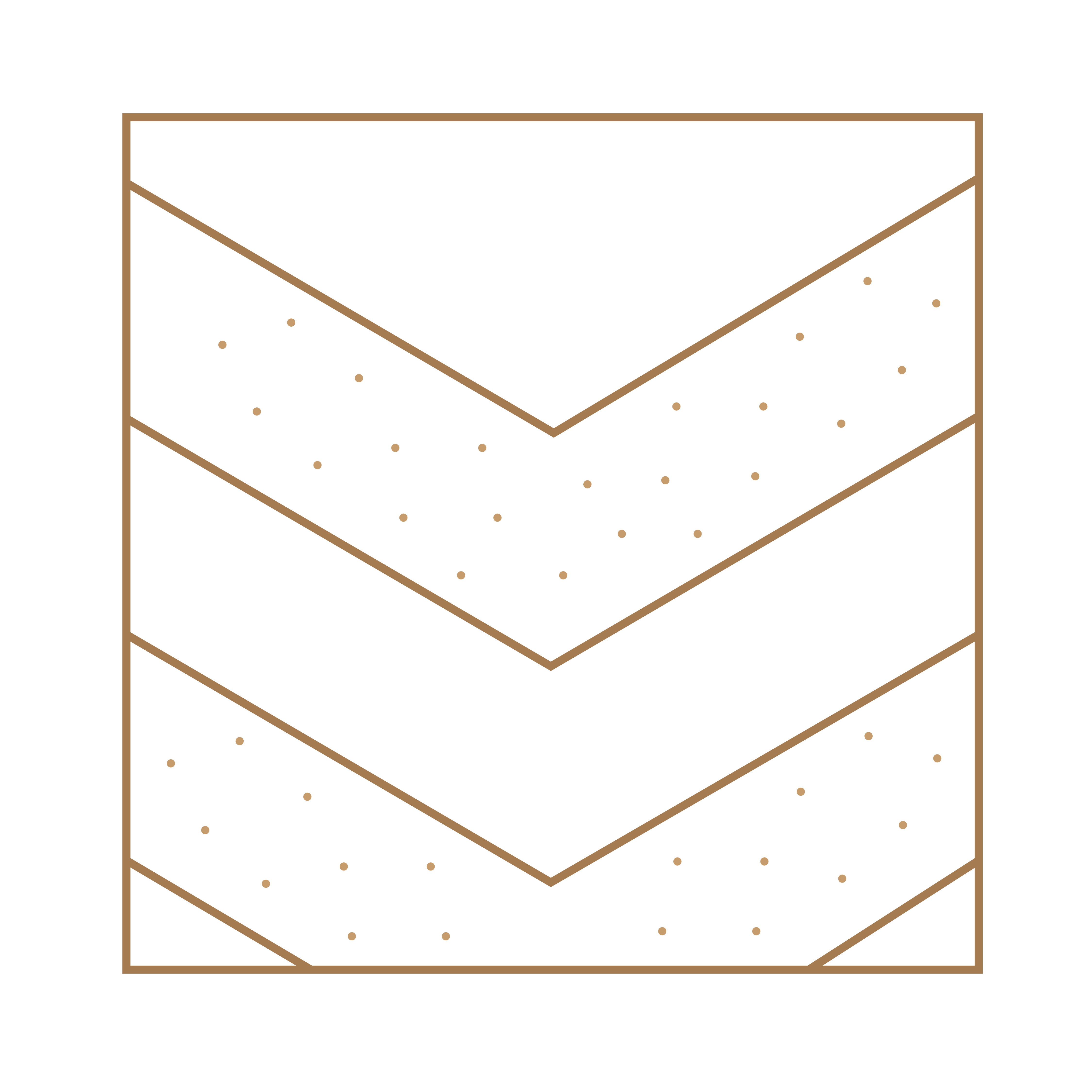
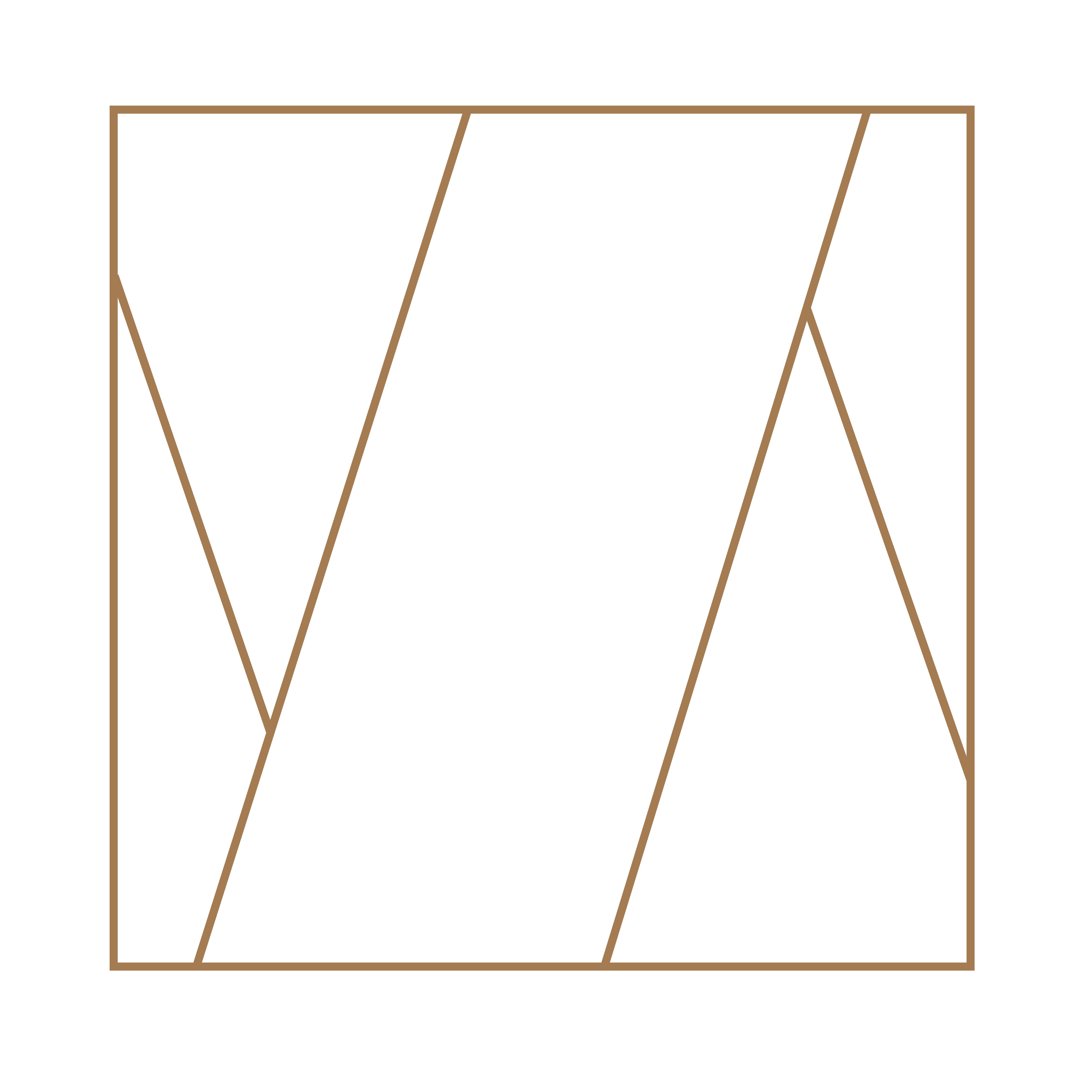
Shaping Your Strategy: How Angles and Curves in Graphic Design Impact Your Marketing Success
Grid Your Lions: How Grids Can Optimize Your Marketing Design and Content

Unlocking the Power of Grids: 3 Common Ways to Elevate Your Graphic Design Choices in Marketing
Beyond the Box: 3 Uncommon Ways to Utilize Grids in Your Graphic Design Choices for Marketing Success

Reaching the Next Generation: 5 Key Strategies for Marketing to Youth Audiences
Marketing to the Experienced: 5 Strategies for Reaching Older Generations
Designing for Elegance: 5 Ways to Create a Rich Look in Your Graphic Design Choices for Marketing

Boho Chic: 5 Tips for Creating a Bohemian Look in Your Graphic Design Choices for Marketing

Delicious Design: 5 Ways to Create a Foodie Look in Your Graphic Design Choices for Food Marketing.

Know Your Audience: How to Identify and Understand Your Target Audience for Effective Marketing

Setting the Foundation: Where to Start When Planning Your Marketing Strategy

Thumbnail Sketching: How Many is Enough for Effective Mock-Up Planning?

Designing for Impact: The Top 3 Website Design Choices for Optimal User Experience

Designing for Impact: The "Flying High: The Top 3 Design Choices for Effective Flyer Design
Bound for Success: The Top 3 Design Choices for Eye-Catching Booklet Design
Slide to Success: The Top 3 Design Choices for Impactful Presentation Design
Making an Impression: The Top 3 Design Choices for Memorable Business Card Design.

Stand Out in the Feed: The Top 3 Design Choices for Effective Social Media Graphics

Reeling Them In: The Top 3 Design Choices for Engaging Video Reel Designs
YouTube Success: The Top 3 Design Choices for Eye-Catching Video Graphics

From Bland to Brilliant: How Graphic Design Impacts the Quality of Your Videos
Cinematography, the art and technique of capturing visual images on film or digitally, plays a crucial role in a marketing strategy for any film or video project. A skilled cinematographer can use a variety of techniques such as lighting, composition, and camera movement to create visually stunning and emotionally impactful images that can be used to market a film or video.
The first and most obvious way that cinematography can be used in a marketing strategy is through the creation of trailers and promotional materials. A well-crafted trailer can give audiences a sense of the film's visual style and tone, while also showcasing key moments and characters. Additionally, promotional materials such as posters and stills can be used to create a visual identity for a film and generate buzz before its release.
Cinematography can also be used to create a sense of immersion and engagement for audiences. A skilled cinematographer can use lighting, camera angles, and movement to create a sense of depth and realism that can draw audiences into a film or video. This sense of immersion can be used to create a more emotional connection with audiences, which can be crucial for building a strong marketing campaign.
Furthermore, Cinematography can also be used to create an aesthetic that is associated with a particular genre or type of film or video. For example, a horror film might use dark, atmospheric lighting and tight close-ups to create a sense of unease, while a romantic comedy might use soft, natural lighting and wide shots to create a sense of warmth and intimacy. These aesthetic choices can be used to align a film or video with a particular genre or target audience, which can be an important consideration in a marketing strategy.
Moreover, Cinematography can also be used to tell a story and to convey important information in a visual way. A skilled cinematographer can use camera angles and movement to communicate information about a character's perspective or to create a sense of tension or suspense. This ability to tell a story visually can be a powerful tool in a marketing campaign, as it can be used to create a sense of intrigue and excitement for audiences.
In conclusion, Cinematography plays a crucial role in a marketing strategy for any film or video project. It can be used to create visually stunning and emotionally impactful images that can be used to market a film or video. By using techniques such as lighting, composition, and camera movement, a skilled cinematographer can create a sense of immersion and engagement for audiences, as well as align a film or video with a particular genre or target audience. Additionally, Cinematography can also be used to tell a story and convey important information in a visual way. All of these elements are important in creating a successful marketing campaign for a film or video.
Graphic design is a powerful tool for engaging an audience. Whether you're creating a website, a brochure, or a social media campaign, the visual elements you choose can make a big difference in how well your message is received. In this article, we'll explore some tips and best practices for using graphic design to connect with your audience and achieve your marketing goals.
1. Understand your audience
The first step in creating effective graphic design is to understand your audience. This means researching their demographics, interests, and pain points. By understanding what they care about and what they're looking for, you can create visual elements that resonate with them.
2. Make it visually appealing
People are naturally drawn to visually appealing designs. This means using colors, shapes, and images that are pleasing to the eye. It also means paying attention to details such as alignment, spacing, and typography. By making your design visually appealing, you'll be more likely to capture people's attention and keep them engaged.
3. Keep it simple
Simplicity is key when it comes to graphic design. Complex designs can be overwhelming and confusing, and can make it difficult for people to understand your message. Instead, focus on creating simple designs that are easy to understand and interpret. This means using simple shapes, limited colors, and clear typography.
4. Use storytelling
Storytelling is a powerful way to engage an audience. By using visual elements to tell a story, you can create an emotional connection with your audience and make it more likely that they'll remember your message. For example, you can use images and illustrations to convey a message or create a sense of nostalgia.
5. Use humor
Humor is a great way to connect with your audience and make your message more memorable. By using visual elements that are funny or playful, you can create a sense of lightheartedness and make it more likely that people will pay attention to your message.
6. Keep it consistent
Consistency is essential when it comes to graphic design. By using consistent elements such as colors, fonts, and imagery, you can create a sense of unity and make it easier for people to recognize your brand. It's also important to maintain consistency across all of your marketing materials, whether it's your website, brochure, or social media posts.
7. Make it interactive
Interactive elements, such as animations and hover effects, can make your designs more engaging. By allowing people to interact with your design, you can create a sense of engagement and make it more likely that they'll remember your message.
8. Use data visualization
Data visualization is a powerful way to present information in a way that's easy to understand. By using charts, graphs, and infographics, you can make complex data more accessible and engaging. This is especially useful for industries such as finance, technology, and data analytics.
9. Test and iterate
Finally, it's important to test and iterate your designs. By testing different elements such as colors, images, and typography, you can see what works and what doesn't. Based on the feedback, you can then make adjustments and continue to improve your designs.
In conclusion, graphic design is a powerful tool for engaging an audience. By understanding your audience, making your designs visually appealing, keeping it simple, using storytelling, humor, consistency, interaction, data visualization and testing and iterating, you can create visual elements that resonate with them and achieve your marketing goals. It's important to remember that graphic design is an iterative process, and you should always be willing to experiment and make adjustments to optimize your designs and connect with your audience.
Pinterest is a powerful visual search engine and social media platform that can be used to drive traffic to a website, increase brand awareness, and generate leads and sales. In order to make the most of this platform, it is important to understand how to create effective Pinterest posts.
First and foremost, it is important to understand the importance of high-quality images. When creating a Pinterest post, the image should be the focal point. It should be visually appealing, high-resolution, and have a clear focal point. The image should also be relevant to the content of the post, as this will help to increase engagement and drive traffic to your website.
Another important aspect of creating effective Pinterest posts is to optimize them for search. This can be done by using keywords in the post's title, description, and tags. This will help to make your post more discoverable by users who are searching for relevant content on the platform. Additionally, it is important to use hashtags in your posts, as this will also help to increase discoverability.
Another important aspect of creating effective Pinterest posts is to use a mix of different types of content. This includes using a mix of pins and videos. Pins are the standard type of post on the platform, and are used to share images and information. Videos are also a great way to share content, as they are more engaging and can be used to showcase products, services, or tutorials.
In addition to creating high-quality images and optimizing posts for search, it is also important to be consistent in your posting schedule. This means that you should aim to post new content on a regular basis, and should also take the time to engage with your followers. This can be done by responding to comments and messages, and by re-pinning content from other users.
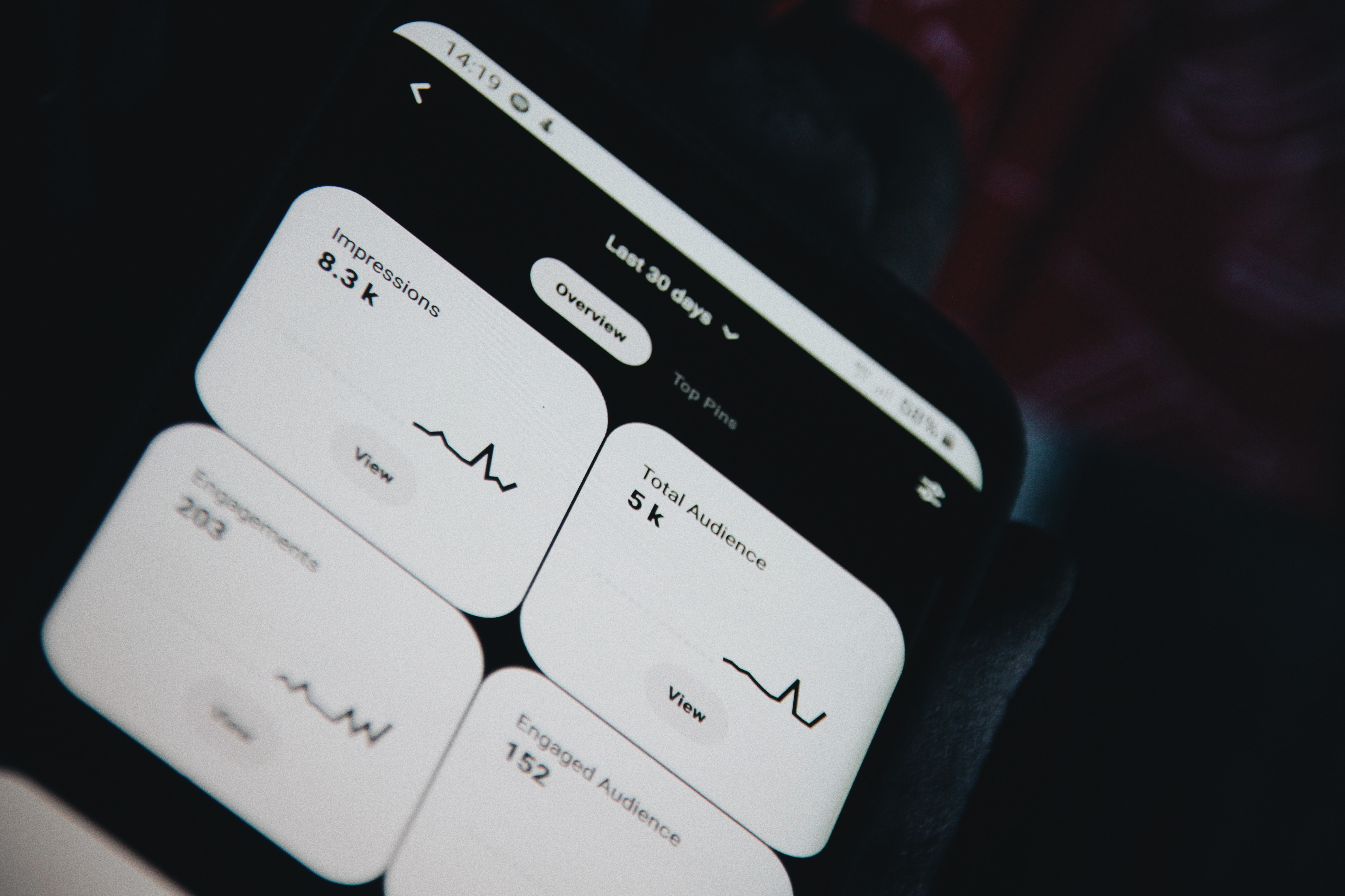
Another important aspect of creating effective Pinterest posts is to use analytics to track your progress. This will allow you to see which posts are performing well and which are not, and to make adjustments as needed. Analytics can also be used to track your website traffic, conversion rates, and other key metrics, which will give you a better understanding of how your Pinterest marketing efforts are impacting your overall business goals.
In conclusion, creating effective Pinterest posts is essential for driving traffic to your website, increasing brand awareness, and generating leads and sales. By understanding the importance of high-quality images, optimizing posts for search, using a mix of different types of content, being consistent in your posting schedule, and using analytics to track your progress, you can create effective Pinterest posts that will help to grow your business. Additionally, It's also important to stay up-to-date with the latest trends and best practices on the platform.
The Hero's Journey is a storytelling framework that has been used for centuries in literature and film to create compelling and relatable narratives. It is a pattern of narrative structure that can be found in many of the world's most popular stories, from The Odyssey to Star Wars. In recent years, marketers have begun to adopt this framework as a way to create more engaging and effective marketing campaigns.
The Hero's Journey is a pattern of narrative structure that consists of several stages. The first stage is the "Call to Adventure," in which the hero is presented with a challenge or opportunity that requires them to leave their familiar world and embark on a journey. This is followed by the "Refusal of the Call," in which the hero initially resists the call to adventure, but ultimately decides to accept it.
The next stage is the "Meeting with the Mentor," in which the hero receives guidance and advice from a wise and experienced figure. This is followed by the "Crossing the Threshold," in which the hero crosses into the unknown and begins the main part of their journey.
During the journey, the hero faces a series of obstacles and trials, known as the "Tests, Allies, Enemies" stage. This stage is where the hero develops the skills and knowledge they need to succeed in their quest. The hero may also make allies and enemies during this stage, which will have an impact on their journey.
After overcoming the obstacles and trials, the hero reaches the "Approach to the Inmost Cave," in which they confront their innermost fears and doubts. This is followed by the "Ordeal," in which the hero faces their greatest challenge and must make a sacrifice to continue on their journey.
The next stage is the "Reward (Seizing the Sword)," in which the hero receives a reward for their sacrifice and gains the knowledge and power they need to succeed in their quest. This is followed by the "The Road Back," in which the hero must return home and share the knowledge and power they have gained with others.
The final stage is the "Return with the Elixir," in which the hero returns home as a changed person, having gained new insight and understanding from their journey. This stage is where the hero's journey comes full circle, and they are able to share the benefits of their journey with others.
Marketers can use the Hero's Journey framework to create more engaging and effective marketing campaigns by aligning their messaging and storytelling with the stages of the journey. By doing so, they can create a narrative that resonates with their target audience, and helps them to identify with the hero and their journey.
For example, a company could use the "Call to Adventure" stage to introduce a new product or service, and position it as a challenge or opportunity that will help the customer to improve their life in some way. The company could then use the "Meeting with the Mentor" stage to provide information and guidance on how to use the product or service, and the "Crossing the Threshold" stage to show customers how the product or service will help them to overcome their current challenges and improve their lives.
During the "Tests, Allies, Enemies" stage, the company could use customer testimonials to show how the product or service has helped others to overcome similar challenges, and position the company as an ally to the customer. The "Approach to the Inmost Cave" and "Ordeal" stages could be used to address any concerns or objections that customers may have about the product or service, and position the company as a trusted guide and mentor.
In the "Reward (Seizing the Sword)" stage, the company could show how the product or service has helped the customer to achieve.
When it comes to marketing, it can be easy to get stuck in a rut. Whether you're working on a campaign that just isn't resonating with you or you're feeling uninspired in your day-to-day work, it can be difficult to find motivation and inspiration. However, there are a few key strategies that you can use to get inspired and reignite your passion for marketing.
First, it's important to step back and take a break. Sometimes, when we're feeling uninspired, it's because we've been working on the same thing for too long. Taking a break can give you some distance from the project and allow you to come back to it with fresh eyes. This can be as simple as going for a walk or taking a vacation, but it can also involve taking a sabbatical or even switching to a different role within your organization.
Second, try to focus on the problem, not the solution. When you're feeling uninspired, it can be easy to get caught up in the details of a campaign or strategy. However, by focusing on the problem that you're trying to solve, you can often find new and more creative solutions. For example, instead of thinking about how to increase sales of a product, think about what problem the product is solving for your customers and what needs they have that are not being met. This can help you to come up with new and more innovative marketing strategies.
Third, surround yourself with inspiration. Whether it's through books, podcasts, or other resources, immersing yourself in inspiration can be a great way to get motivated. Reading about the latest marketing trends, listening to other marketers share their stories, or even following industry leaders on social media can be a great way to get your creative juices flowing. In addition, you can also seek out the advice of a mentor or someone who has gone through similar struggles in their marketing career.
Fourth, try something new. Sometimes, the best way to get inspired is to try something new. This could be as simple as experimenting with a new marketing channel or as complex as launching a new product or service. By taking on a new challenge, you can stretch your skills and learn something new. This can also help you to find new ways of looking at your marketing strategies and come up with new and innovative ideas.
Finally, don't be afraid to fail. Failure is an inevitable part of marketing, and it's often through failure that we learn the most. Instead of fearing failure, embrace it. Learn from your mistakes and use them to improve your marketing strategies. By taking risks and trying new things, you can often find the inspiration that you need to get motivated and achieve success.
In conclusion, finding inspiration in marketing can be challenging, but it's not impossible. By taking a break, focusing on the problem, surrounding yourself with inspiration, trying something new, and embracing failure, you can reignite your passion for marketing and achieve success. Remember, the key is to stay positive and keep an open mind. With the right attitude and approach, you can overcome any obstacle and achieve your marketing goals.
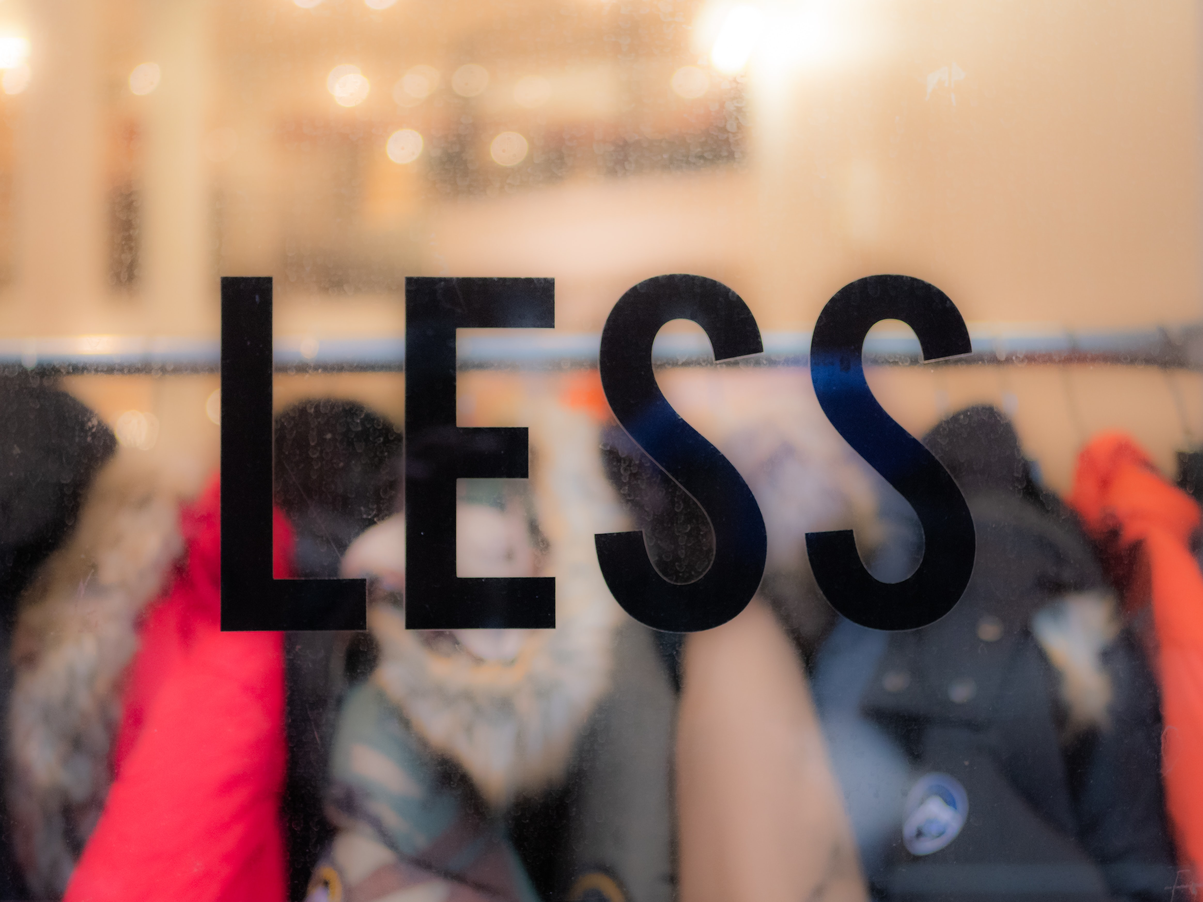
Negative space, also known as white space, is the area of a design or composition that is left unoccupied. In marketing, negative space can be used to draw attention to the desired outcome, such as a call to action or a specific product feature.
One way to use negative space in marketing is through typography. By creating a balance of negative space and text, the eye is naturally drawn to the text and the message becomes more legible. This can be done by increasing the space between lines of text, or by using a larger font size for key words or phrases.
Another way to use negative space in marketing is through imagery. By placing an object or product in the center of the frame with negative space surrounding it, the eye is naturally drawn to the object. This can be used to draw attention to a specific product feature or to create a sense of elegance or sophistication.
Negative space can also be used in layout design. By leaving ample negative space around key elements such as headlines or calls to action, the eye is drawn to these elements and they become more prominent. This can be used to guide the viewer's attention towards the desired outcome, such as a call to action or a specific product feature
Additionally, negative space can be used to create a sense of hierarchy within a design. By using different amounts of negative space around different elements, the viewer's eye is guided to the most important elements first. This can be used to prioritize information and guide the viewer towards the desired outcome.
In advertising, Negative space can be utilized to create visual interest and make the ad stand out from the competition. Negative space can be used to create contrast, making the ad more visually appealing and memorable. This can be done by contrasting light and dark areas, or by contrasting positive and negative space.
In packaging design, negative space can be used to create a sense of minimalism and elegance. By using negative space, the packaging becomes less cluttered and the product itself becomes the focus. This can be used to draw attention to specific product features or to create a sense of luxury.
In summary, negative space can be a powerful tool in marketing and design. By using negative space to draw attention to the desired outcome, such as a call to action or a specific product feature, the message becomes more legible and the overall design becomes more visually appealing. By creating a balance between negative space and other elements, the viewer's eye is naturally drawn to the most important elements and the desired outcome is emphasized. Negative space can be used in a variety of mediums, including typography, imagery, layout design, advertising, and packaging design, to make the message more memorable and effective.
Mood plays a significant role in how individuals make decisions and interact with the world around them. This is also true in the context of marketing, as one's mood can greatly impact the effectiveness of a marketing strategy.
When individuals are in a positive mood, they tend to be more open to new ideas and more likely to make a purchase. Positive moods can also lead to increased brand loyalty and a greater likelihood of sharing positive experiences with others. In contrast, negative moods can lead to a decrease in brand loyalty and a reluctance to make a purchase.
Marketers can capitalize on this by creating marketing campaigns that evoke positive emotions and create a sense of happiness or excitement. This can be achieved through the use of bright colors, upbeat music, and uplifting language. For example, a car commercial featuring a family laughing and having a good time while driving in their new car is likely to evoke positive emotions and make viewers more inclined to consider purchasing the car themselves.
Another way to leverage the relationship between mood and marketing is through the use of personalization. When individuals feel that a brand is speaking directly to them and understanding their needs, they are more likely to have a positive association with the brand. Personalization can be achieved through targeted advertising, personalized email campaigns, and even customizing the layout of a website based on the user's browsing history.
However, it's important to note that while positive moods can lead to increased sales, a negative mood can also be leveraged by marketers in certain circumstances. For example, if a company is selling a product or service that aims to solve a problem or address a specific pain point, tapping into negative emotions related to that problem can be a powerful tool for driving sales. A commercial for a home security system, for example, might evoke feelings of fear or anxiety in order to convince viewers of the importance of protecting their homes.
It's also important to consider cultural and societal factors when it comes to mood and marketing. Different cultures may have different associations with certain colors, symbols, and emotions, and it's essential to take these cultural nuances into account when creating marketing campaigns. Failure to do so could lead to a marketing campaign that falls flat or even offends potential customers.
In summary, understanding the relationship between mood and marketing is crucial for creating effective marketing strategies. By evoking positive emotions and leveraging personalization, marketers can increase brand loyalty and drive sales. On the other hand, negative emotions can also be leveraged in certain circumstances to drive sales. It's important to consider cultural and societal factors when creating marketing campaigns to ensure that they resonate with the target audience.
Dreams can be a powerful tool for planning a marketing strategy, providing valuable insights into consumer behavior, preferences, and desires. Dreams can be used to gain a deeper understanding of target audiences, identify new opportunities, and develop effective messaging and creative concepts.
One way that dreams can be useful in marketing is by providing insight into consumer behavior. Dreams can reveal how consumers feel about a product or service, what they are looking for in a brand, and what motivates them to make a purchase. For example, a dream about a consumer struggling to find the perfect pair of shoes could indicate that there is a gap in the market for a shoe brand that focuses on comfort and fit. This information can be used to develop a marketing strategy that addresses the consumer's needs and wants.
Dreams can also be used to identify new opportunities for a brand. For example, a dream about a consumer using a product in an unexpected way could indicate that there is potential for the brand to expand into new markets or develop new product lines. For example, a dream about a consumer using a brand of cleaning products to clean their car could indicate that there is potential for the brand to develop a line of car cleaning products.
Dreams can also be used to develop effective messaging and creative concepts for a marketing campaign. For example, a dream about a consumer feeling relaxed and rejuvenated after using a product could be used as the basis for a marketing campaign that focuses on the benefits of relaxation and rejuvenation. This can be used to create a message that resonates with consumers and makes them more likely to purchase the product.
Dreams can also be used to understand consumer preferences and desires. For example, a dream about a consumer trying different types of food could indicate that there is a desire for more diverse or unique food options. This information can be used to develop a marketing strategy that appeals to consumers' desire for new and exciting experiences.
In conclusion, Dreams can be a valuable tool for planning a marketing strategy. They can provide insight into consumer behavior, identify new opportunities, and develop effective messaging and creative concepts. By using dreams to gain a deeper understanding of target audiences, brands can create marketing strategies that are more effective, more relevant, and more appealing to consumers. It's important to note that dream analysis is not a science and is open for interpretation, therefore it's important to complement it with other market research methods.
Culture plays a crucial role in how businesses and organizations market their products and services to different target audiences. Understanding the cultural nuances of a particular group can mean the difference between a successful marketing campaign and one that falls flat.
One of the most important aspects of marketing to a specific cultural group is understanding the values and beliefs of that group. Different cultures have different ways of viewing the world, and this can greatly affect how they perceive and respond to marketing messages. For example, in collectivist cultures such as China and Japan, the emphasis is on group harmony and the needs of the community as a whole. This means that marketing messages that focus on the benefits to the community, rather than the individual, are more likely to resonate with these audiences. In contrast, in individualistic cultures such as the United States and Canada, the emphasis is on the needs and wants of the individual. Therefore, marketing messages that focus on the benefits to the individual are more likely to resonate with these audiences.
Another important aspect of marketing to different cultural groups is understanding the different communication styles used by that group. Different cultures have different ways of expressing themselves, and this can greatly affect how they respond to different types of marketing messages. For example, in some cultures, direct and straightforward communication is highly valued, while in other cultures, indirect and subtle communication is preferred. Understanding these communication styles can help businesses and organizations tailor their marketing messages to better appeal to the target audience.
Another key aspect of marketing to different cultural groups is understanding the different symbols, colors and imagery that are associated with that group. Different cultures have different associations with certain symbols, colors, and imagery, and this can greatly affect how they respond to different types of marketing messages. For example, in Western cultures, the color white is often associated with purity and innocence, while in Eastern cultures, the color white is associated with death and mourning. Therefore, using the color white in a marketing campaign targeting Western audiences may evoke different emotions than using the color white in a marketing campaign targeting Eastern audiences.
In addition to understanding the values, beliefs, communication styles, symbols, colors and imagery of a particular cultural group, it is also important to understand the demographics of that group. Different demographic groups within a culture may have different needs, wants and purchasing behaviors, and this can greatly affect how they respond to different types of marketing messages. For example, older adults may have different needs and wants than younger adults, and this can greatly affect how they respond to different types of marketing messages. Therefore, businesses and organizations need to consider the demographics of their target audience when developing their marketing campaigns.
In conclusion, understanding and appreciating the cultural nuances of different target audiences is essential for effective marketing. By understanding the values, beliefs, communication styles, symbols, colors, imagery, and demographics of a particular cultural group, businesses and organizations can tailor their marketing messages to better resonate with that group and increase their chances of success. It's important to remember that culture is not a one-size-fits-all concept, and the nuances and subtleties of different cultures must be considered in order to create effective marketing strategies.
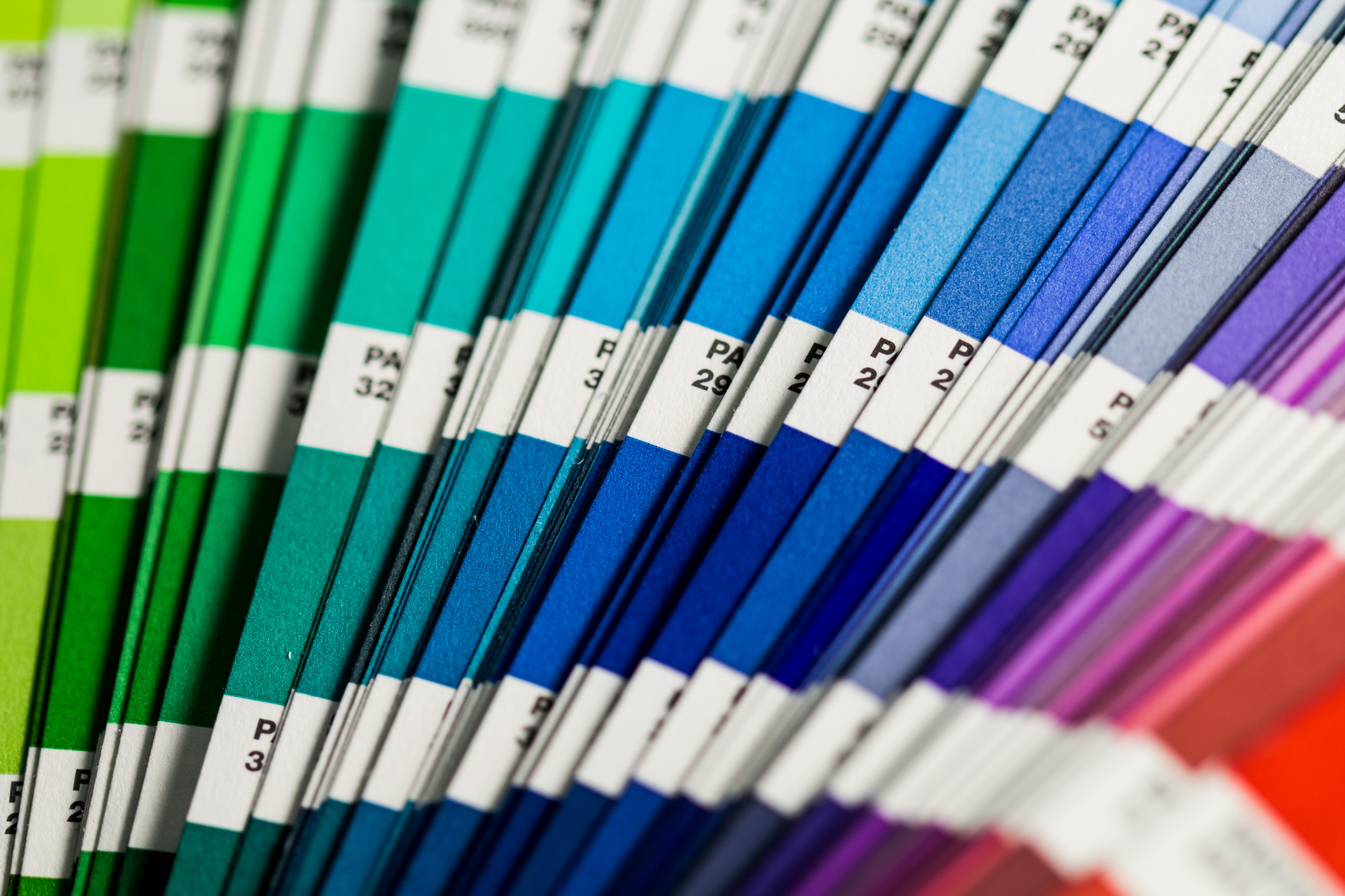
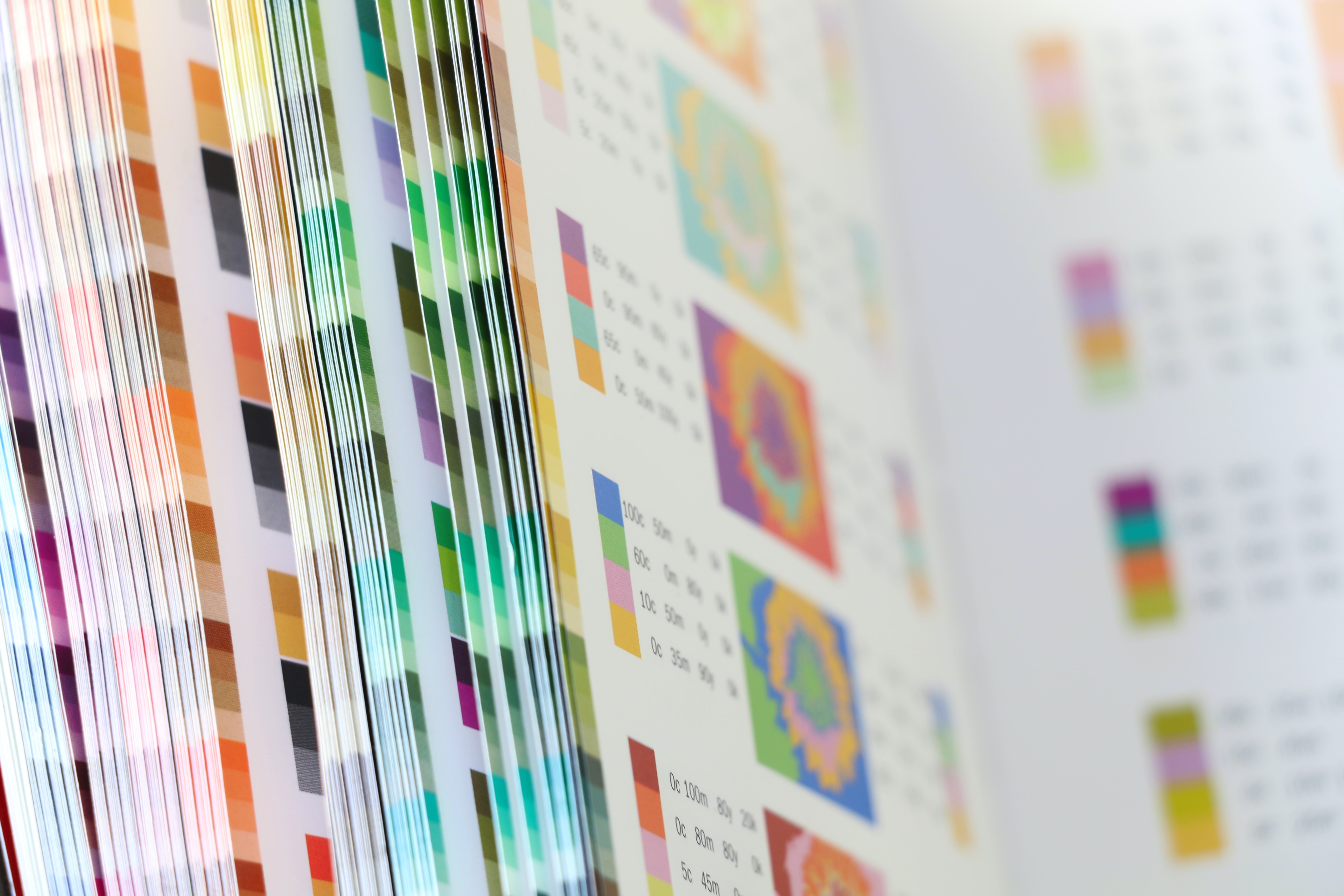
The use of color in design can have a powerful impact on the mood and perception of an audience. Different colors can evoke different emotions and associations, and understanding these effects can help designers create more effective and impactful designs.
One of the most basic ways in which color can affect mood is through its ability to evoke certain emotions. For example, warm colors like red, orange, and yellow are often associated with excitement, energy, and warmth, while cool colors like blue, green, and purple are associated with calmness, serenity, and professionalism. By using the appropriate colors in a design, a designer can create a desired emotional response in the audience.
Another way in which color can affect mood is through its ability to create a sense of depth and space. Warm colors tend to appear closer, while cool colors tend to appear farther away. By playing with this effect, designers can create a sense of depth and dimension in a design, making it more visually interesting and engaging.
Color can also be used to create a sense of hierarchy and organization in a design. For example, using a single, bold color as an accent can draw the viewer's eye to a particular part of the design, creating a focal point. Similarly, using contrasting colors can create a sense of division and organization, making a design easier to understand and navigate.
The absence of color, or using a monochromatic color scheme can also have an impact on the mood of the audience. Monochrome designs can be elegant and sophisticated, but also can appear cold, serious and unapproachable. On the other hand, designs that use a variety of colors can be more playful and energetic, but can also be overwhelming and chaotic.
In addition to its emotional and visual effects, color can also have cultural and symbolic associations. For example, in Western cultures, white is often associated with purity, innocence, and cleanliness, while black is associated with power, sophistication, and formality. In Eastern cultures, however, white is often associated with death and mourning, while red is associated with luck and happiness. Understanding these cultural associations can help designers create designs that are more meaningful and relevant to a particular audience.
It is important to note that the impact of color on mood can also depend on context and personal preference. What might evoke a feeling of serenity in one person may evoke feelings of sadness in another. Therefore, designers should always consider the intended audience and their preferences when choosing colors for a design.
In conclusion, color is a powerful tool in design and can greatly affect the mood of an audience. The use of color can evoke certain emotions, create a sense of depth and space, and create a sense of hierarchy and organization. Designers should consider the intended audience, their preferences and cultural associations when choosing colors for a design. The absence of color or a monochromatic design can also have an impact on the mood of the audience. Understanding the impact of color on mood can help designers create more effective and impactful designs
Primary colors, also known as the "elementary" or "basic" colors, are red, blue, and yellow. These colors are considered primary because they cannot be created by mixing other colors together. They are the building blocks for all other colors in the color spectrum.
In marketing, the use of primary colors can have a significant impact on the effectiveness of a campaign. Each primary color has its own unique psychological effects on the viewer and can evoke different emotions and associations.
Red is often associated with excitement, energy, and passion. It is a powerful color that can grab attention and create a sense of urgency. This makes it an ideal choice for advertisements that want to generate buzz and increase sales. Companies in the food and retail industry often use red in their branding and marketing efforts. For example, Coca-Cola and McDonald's use red prominently in their logos and advertising
Blue is often associated with trust, reliability, and security. This color can evoke feelings of calm and serenity, making it a great choice for companies that want to communicate trustworthiness and stability. Financial institutions, insurance companies, and technology companies often use blue in their branding and marketing efforts. For example, American Express and IBM use blue in their logos and advertising.
Yellow is often associated with joy, optimism, and happiness. It is a warm and inviting color that can evoke feelings of positivity and enthusiasm. This makes it a great choice for companies that want to communicate a sense of fun and excitement. Companies in the entertainment and children's products industry often use yellow in their branding and marketing efforts. For example, Nikon and Lego use yellow in their logos and advertising.
Using primary colors in your marketing strategy can also help create visual interest and make your brand more memorable. By using a combination of primary colors, you can create a color palette that is unique to your brand and helps it stand out from the competition. For example, a company that wants to communicate a sense of trustworthiness and stability, might use blue and red in their branding and marketing efforts. This creates a strong and striking visual contrast that can make the company's marketing materials more memorable.
However, it's important to note that the use of primary colors alone is not enough to create a successful marketing campaign. The use of primary colors should be part of a larger strategy that takes into account the target audience, the message that you want to communicate, and the medium that you are using to deliver that message.
Additionally, it's important to be aware of cultural differences in color associations. For example, in Western cultures, white is often associated with purity and innocence, while in Eastern cultures, white is often associated with mourning and death. Therefore, it's essential to consider the cultural context of your target audience when developing your marketing strategy.
In conclusion, primary colors can be a powerful tool in your marketing strategy. Each primary color has its own unique psychological effects on the viewer and can evoke different emotions and associations. By understanding the psychological effects of primary colors, you can use them to create visual interest and make your brand more memorable. However, it's important to remember that the use of primary colors alone is not enough to create a marketing strategy.
The use of secondary colors in marketing can have a significant impact on the overall effectiveness of a campaign. Secondary colors are created by mixing primary colors together, and include orange, green, and purple. These colors can evoke different emotions and associations in consumers, and can be used to target specific demographics or to create a certain atmosphere.
One way in which secondary colors can be used in marketing is to evoke a sense of warmth and familiarity. Orange, for example, is often associated with feelings of excitement and energy. This can be useful in advertising campaigns that are designed to appeal to a younger demographic, as well as those that focus on outdoor activities or vacation destinations. In contrast, green is often associated with feelings of calm and tranquility. This color can be effective in advertising campaigns that focus on health and wellness products, as well as those that promote environmental sustainability.
Another way in which secondary colors can be used in marketing is to create a sense of luxury and exclusivity. Purple, for example, is often associated with wealth and prestige. This color can be used in advertising campaigns that target high-end consumers, such as those for luxury goods and services. In contrast, blue is often associated with feelings of trust and reliability. This color can be effective in advertising campaigns for financial services or for products that are marketed as being safe and dependable.
In addition to evoking certain emotions and associations, secondary colors can also be used to create a certain atmosphere or mood. For example, orange can be used to create a sense of excitement and energy, while green can be used to create a sense of calm and tranquility. This can be particularly effective in advertising campaigns that focus on creating a certain experience or atmosphere, such as those for restaurants, hotels, or other types of tourist destinations.
However, it's important to consider the context and the target audience when using secondary colors. For example, different cultures may have different associations with certain colors. While orange may be associated with excitement and energy in Western cultures, it may be associated with mourning in some Asian cultures. Additionally, certain colors may be more appropriate for certain industries or products. For example, green may be more appropriate for advertising campaigns that focus on environmental sustainability, while purple may be more appropriate for advertising campaigns that focus on luxury goods and services.
In conclusion, the use of secondary colors in marketing can have a significant impact on the overall effectiveness of a campaign. By understanding the emotions and associations evoked by different colors, as well as the atmosphere and mood they can create, marketers can use secondary colors to target specific demographics, create a sense of luxury and exclusivity, or to create a certain experience or atmosphere. However, it's important to consider the context and the target audience when using secondary colors. By taking these factors into account, marketers can use secondary colors to effectively communicate their message and achieve their marketing goals.
The use of cool color tones in marketing can have a significant impact on the effectiveness of a campaign. Cool colors, such as blues and greens, are often associated with feelings of calmness, trust, and stability, making them ideal for building brand trust and promoting a sense of reliability.
One of the most notable ways in which cool color tones can be used in marketing is through the creation of a strong brand identity. By incorporating cool colors into your branding, such as using a blue logo or green packaging, you can create a sense of trust and reliability in the minds of consumers. This can be especially effective for businesses in industries such as finance, healthcare, or technology, where trust and reliability are of the utmost importance.
In addition to building brand trust, cool color tones can also be used to promote a sense of calmness and relaxation. This can be particularly effective in the marketing of products and services related to self-care and wellness, such as skincare products, yoga classes, or spas. By incorporating cool colors into your marketing materials, you can create a sense of calm and relaxation in the minds of consumers, making them more likely to consider your products or services.
Another way cool color tones can be used in marketing is to create a sense of professionalism and authority. For example, a business in the legal or financial industry might use a cool blue color scheme to create a sense of professionalism and authority. This can help to establish the business as a credible and trustworthy source of information or services.
Furthermore, cool color tones can be used to create a sense of elegance and luxury. This can be especially effective in the marketing of high-end products or services, such as luxury cars, designer clothing, or high-end real estate. By incorporating cool colors into your marketing materials, you can create a sense of elegance and luxury that can make your products or services more desirable to consumers.
Finally, it's important to use cool color tones in a consistent manner. Inconsistent use of color can create confusion and make it difficult for consumers to recognize your brand. To ensure consistency, it's important to establish a color palette that you can use across all of your marketing materials, including your website, packaging, and print materials.
In conclusion, cool color tones can have a significant impact on the effectiveness of your marketing strategy. By incorporating cool colors into your branding, you can create a sense of trust and reliability in the minds of consumers. Additionally, cool colors can be used to promote feelings of calmness and relaxation, professionalism and authority, and elegance and luxury. It's important to use cool color tones consistently across all of your marketing materials to ensure brand recognition.
The use of warm color tones in marketing can greatly affect a consumer's perception of a brand and its products. Warm colors, such as red, orange, and yellow, are known to evoke emotions of excitement, energy, and warmth. These colors can be used strategically in marketing to grab the attention of potential customers and create a sense of urgency.
One of the most effective ways to use warm colors in marketing is through the use of a color scheme. For example, using a warm color as the primary color and pairing it with neutral tones can create a sense of balance and make the warm color stand out. This can be especially effective in print advertisements, where the color scheme can be used to draw the reader's attention to the most important information.
Warm colors can also be used to create a sense of urgency in marketing campaigns. For example, using a bright red color in a sale advertisement can create a sense of urgency and encourage customers to take advantage of the sale before it ends. This can also be used in email marketing campaigns, where a brightly colored call-to-action button can stand out and encourage customers to take action.
In addition to creating a sense of urgency, warm colors can also be used to create a sense of excitement and energy. For example, using warm colors in a product launch campaign can create a sense of excitement and anticipation for the new product. This can be especially effective in social media marketing, where the use of warm colors can make a brand's posts stand out in a feed and grab the attention of potential customers.
Another way to use warm colors in marketing is to create a sense of warmth and comfort. For example, using warm colors in a home goods or interior design product campaign can create a sense of comfort and make the products more inviting. This can be especially effective in visual marketing, such as product photography or video advertisements.
It's important to note that the use of warm colors should be done in moderation. Using too many warm colors can be overwhelming and may turn off potential customers. It is essential to find the right balance and use warm colors strategically in marketing campaigns.
In conclusion, the use of warm color tones can greatly affect a consumer's perception of a brand and its products. Warm colors can be used strategically in marketing to grab the attention of potential customers, create a sense of urgency, excitement, energy and warmth. By using warm colors in the right way, brands can make their marketing campaigns more effective and successful. It is crucial to keep in mind to use warm colors in moderation and in the right context to achieve the desired results.
In today's fast-paced digital world, a company's marketing strategy plays a crucial role in its success. One important aspect of a successful marketing strategy is the use of angles and curves in graphic choices. These design elements can be used to create a sense of movement, convey a specific message, and even evoke emotions in viewers..
Angles, in particular, can be used to create a sense of movement and direction in graphics. For example, diagonal lines can be used to convey a sense of action or movement, while horizontal lines can be used to convey a sense of stability. Additionally, angles can be used to direct the viewer's attention to a specific area or element within a graphic.
Curves, on the other hand, can be used to create a sense of fluidity and elegance. They can also be used to convey a sense of softness or femininity. For example, a curved line in a graphic can be used to convey a sense of relaxation or calmness. Additionally, curves can be used to create a sense of continuity and connection within a graphic.
Both angles and curves can be used together to create an even more dynamic and impactful graphic. For example, the use of diagonal lines and curves can create a sense of movement and fluidity, while the use of horizontal lines and angles can create a sense of stability and direction.
In terms of marketing strategy, the use of angles and curves in graphic choices can be used to convey specific messages and evoke specific emotions in viewers. For example, a company that wants to convey a sense of strength and power in its branding might use angles and sharp lines in its graphics, while a company that wants to convey a sense of relaxation and luxury might use curves and soft lines in its graphics.
Additionally, the use of angles and curves in graphic choices can also be used to appeal to specific demographics. For example, a company that wants to appeal to a younger, more tech-savvy audience might use more angles and sharp lines in its graphics, while a company that wants to appeal to an older, more traditional audience might use more curves and soft lines in its graphics.
Overall, the use of angles and curves in graphic choices can play a crucial role in a company's marketing strategy. These design elements can be used to create a sense of movement, convey specific messages and evoke specific emotions in viewers, and appeal to specific demographics. When used effectively, angles and curves can help a company to create a strong and impactful brand that resonates with its target audience.
In summary, angles and curves are powerful design elements that can be used to create a sense of movement, convey specific messages and evoke specific emotions in viewers. They can also be used to appeal to specific demographics. It is important to use these design elements in a way that aligns with your marketing strategy and target audience.
Grids are an essential element of design that can be used in a variety of ways to enhance marketing materials. They provide a structure and organization that helps guide the viewer's eye through the content and make it more easily digestible. In this article, we will explore how grids can be utilized in marketing and the benefits they provide.
One of the most common ways grids are used in marketing is in the layout of printed materials such as brochures, flyers, and posters. By using a grid, designers can create a consistent and structured layout that is easy to read and visually pleasing. The grid can be used to establish a hierarchy of information, with the most important information placed in the most prominent positions. This allows the viewer to quickly understand the main message of the marketing material and make a decision about whether they are interested in learning more.
Grids can also be used in web design to create a consistent and organized layout. Websites that use a grid layout are often easier to navigate and more visually appealing than those that do not. By using a grid, designers can create a consistent layout that guides the viewer's eye through the content and makes it more easily digestible. This can improve the user experience and increase the likelihood of conversion.
Grids can also be used to create visual interest and draw attention to specific elements. One way this is done is by using contrasting elements, such as different colors or shapes, within the grid. This creates visual interest and draws the viewer's eye to the important parts of the marketing material.
Another way to use grids to create visual interest is through the use of typography. By using a grid, designers can create a consistent and structured layout for text, which makes it easier to read and more visually pleasing. This is especially important for marketing materials that rely heavily on text, such as brochures and posters.
In addition to its visual benefits, grids can also be used to create a sense of order and stability in marketing materials. This is particularly important for brands that want to convey a sense of professionalism and reliability. By using a grid, designers can create a consistent and structured layout that gives the impression of order and stability, which can help to build trust with the viewer.
Grids can also be used to create a sense of movement and flow in marketing materials. This is done by using elements such as diagonal lines and curved shapes within the grid. These elements create a sense of movement and flow, which can be used to guide the viewer's eye through the content and make it more engaging.
In conclusion, grids are an essential element of design that can be used in a variety of ways to enhance marketing materials. They provide a structure and organization that makes it easier for the viewer to understand the main message of the marketing material and navigate through the content. Grids can also be used to create visual interest, convey a sense of order and stability, and create a sense of movement and flow. By using a grid, designers can create marketing materials that are visually appealing and effective at communicating the brand's message.
Grids are a fundamental tool in graphic design, used to create balance and hierarchy in designs. They provide a framework for the placement of elements, and can be used in a variety of ways to achieve different design goals. In this article, we will explore three common ways that grids are used in graphic design.
The Rule of Thirds
1. The Rule of Thirds is a basic principle of composition that suggests dividing an image into thirds horizontally and vertically, creating a grid of nine equal parts. The intersections of the lines are considered the most interesting points of the composition, and elements in the design should be placed at or near these points. This creates balance and tension in the design, drawing the viewer's eye to the important elements.
The Rule of Thirds is commonly used in photography and painting, but it can also be applied to graphic design. In print design, it can be used to position text, images, and other elements on a page. For example, in a brochure or poster, the title or main image might be placed at or near one of the intersection points, while supporting information is placed in the other sections of the grid.
Modular Grid
2. A modular grid is a more flexible and complex version of the basic grid. It is made up of a series of columns and rows that divide the design space into modular units. These units can be used to create a consistent rhythm and hierarchy in the design, allowing elements to be easily aligned and positioned.
Modular grids are often used in web and interface design, where they provide a structure for the layout of content. For example, in a website, the modular grid might be used to position the main navigation, header, and content areas. The grid can also be used to create a consistent layout for elements such as buttons, forms, and other interactive elements.
Golden Ratio
3. The Golden Ratio is a mathematical proportion that is often used in art and design. It is defined as the ratio of the smaller part to the larger part is the same as the ratio of the larger part to the whole. The Golden Ratio is often represented by the Greek letter phi (φ) and is approximately 1.6180339887.
In graphic design, the Golden Ratio can be used to create a grid that is based on the proportions of the human body and the natural world. This can be used to create a sense of balance and harmony in the design. The Golden Ratio can be applied to the overall layout of a design, or to specific elements such as text, images, and shapes.
In conclusion, Grids are a fundamental tool in graphic design, used to create balance and hierarchy in designs. They provide a framework for the placement of elements, and can be used in a variety of ways to achieve different design goals. The Rule of Thirds, Modular Grid and Golden Ratio are three common ways that grids are used in graphic design. Each of these methods offers a unique approach to composition and can be used to create designs that are both aesthetically pleasing and effective at communicating information.
Grids are a fundamental aspect of graphic design, providing a structured layout for elements on a page. However, they can also be used in unexpected and creative ways to enhance the visual impact of a design. In this article, we will explore three uncommon ways to use grids in your graphic design choices.
1. Asymmetrical Grids
Traditionally, grids are used to create a symmetrical layout, with elements aligned to a central axis or evenly spaced across the page. However, asymmetrical grids can be used to create a more dynamic and visually interesting design.
An asymmetrical grid is one where the elements on the page are not aligned to a central axis or evenly spaced. Instead, they are arranged in a way that creates a sense of movement and tension on the page. This can be achieved by using different sizes and shapes of elements, or by placing them at different angles.
One example of this is the use of diagonal lines to create a sense of movement across the page. This can be achieved by placing elements at different angles, or by using diagonal lines to connect different parts of the design.
2. Overlapping Grids
Another uncommon way to use grids in your graphic design is by overlapping them. This can be achieved by placing one grid on top of another, creating a sense of depth and movement on the page.
Overlapping grids can also be used to create a sense of hierarchy, with elements on the top grid being more prominent than those on the bottom grid. This can be achieved by using different colors, sizes, and shapes for the elements on the different grids.
3. Breaking the Grid
Finally, one of the most unexpected ways to use grids in graphic design is by breaking the grid. This can be achieved by placing elements in unexpected locations on the page, or by using a grid in a way that is not immediately obvious.
Breaking the grid can create a sense of surprise and intrigue for the viewer, making them stop and take a closer look at the design. This can be achieved by using unexpected shapes and sizes for elements, or by using a grid in a way that is not immediately obvious.
Overall, grids are a powerful tool in graphic design, providing structure and organization to a design. However, they can also be used in unexpected and creative ways to enhance the visual impact of a design. Whether it is through asymmetrical layouts, overlapping grids, or breaking the grid, these techniques can all be used to create unique and visually interesting designs.
It’s important to remember that any design element, including grids, can be pushed and pulled to achieve a desired effect. It’s always worth experimenting with different ways of using design elements, to see what works best for your project, and to develop your own visual style.
Marketing to the younger generation, also known as Gen Z or the iGeneration, requires a different approach than traditional marketing methods. This generation has grown up with technology and social media, and they have a different set of values and behaviors than older generations. In order to effectively market to this demographic, it is important to understand their habits and preferences. Here are five ways to create a marketing strategy targeted at the younger generation:
1. Utilize social media: The younger generation is highly active on social media, and it is an important platform for reaching them. Platforms such as Instagram, TikTok, and Snapchat are popular among this demographic, and they are an effective way to connect with them. Brands should create an active presence on these platforms and engage with their target audience through creative and visually appealing content. Influencer marketing is also an effective way to reach the younger generation. Partnering with influencers who have a large following among the younger generation can help increase brand awareness and drive sales.
2. Create relatable content: The younger generation values authenticity and relatability, and they are more likely to engage with content that speaks to them. Brands should create content that is relevant and relatable to the younger generation, and that addresses the issues and concerns that are important to them. This can include content that focuses on sustainability, social justice, and mental health.
3. Use interactive and immersive experiences: The younger generation is highly visual and interactive, and they are drawn to experiences that are engaging and immersive. Brands can use augmented reality, virtual reality, and other interactive experiences to create an emotional connection with their target audience. This can include virtual try-on features for fashion and beauty products, virtual tours of a brand's store or factory, or interactive games that promote a brand's products or services.
4. Leverage user-generated content: The younger generation values the opinions of their peers, and they are more likely to trust and engage with content that is created by other members of their community. Brands can leverage user-generated content by encouraging their customers to share their experiences and thoughts on social media. This can include product reviews, testimonials, and photos of customers using a brand's products or services.
5. Prioritize mobile optimization: The younger generation is highly mobile-centric, and they rely heavily on their smartphones to access the internet and engage with content. Brands should ensure that their websites, social media profiles, and other digital assets are optimized for mobile devices. This includes using responsive design, fast load times, and easy-to-use navigation.
In conclusion, the younger generation is a valuable target market for brands, and understanding their habits and preferences is crucial for creating an effective marketing strategy. By utilizing social media, creating relatable content, using interactive and immersive experiences, leveraging user-generated content, and prioritizing mobile optimization, brands can effectively connect with the younger generation and drive engagement and sales.
Creating a marketing strategy targeted at the older generation requires a different approach than targeting other demographics. The older generation, also known as seniors or retirees, may have different needs, interests, and behaviors than younger consumers. Below are five ways to create a marketing strategy targeted at the older generation:
1. Understand the older generation's needs and interests.
Seniors may have different needs and interests than younger generations. For example, they may be more interested in products and services related to healthcare, retirement living, and travel. They may also be interested in hobbies and activities that are specific to their age group, such as gardening, knitting, and reading. Understanding the needs and interests of the older generation will help you create a marketing strategy that is relevant and appealing to them.
2. Use traditional marketing channels.
The older generation may not be as active on social media and other digital channels as younger generations. Therefore, it's important to use traditional marketing channels, such as television, radio, and print, to reach them. This includes not only traditional media but also direct mail, brochures and flyers.
3. Use language and visuals that are easy to understand
It's important to use language and visuals that are easy to understand when creating a marketing strategy for the older generation. This means using simple language and avoiding jargon. Additionally, using large font sizes and high-contrast colors will make it easier for seniors to read and understand your marketing materials.
4. Create a sense of community.
Many seniors value a sense of community and connection with others. Creating a sense of community can be achieved by building relationships with older customers, hosting events, and creating a loyalty program. This can help to build trust and create a sense of loyalty among the older generation, making them more likely to return to your business.
5. Address the concerns of older consumers.
Older consumers may have specific concerns, such as accessibility, safety, and security. Addressing these concerns in your marketing materials and in your business practices can help to build trust and establish your business as a reputable and reliable choice for the older generation.
In conclusion, creating a marketing strategy targeted at the older generation requires a different approach than targeting other demographics. Understanding the needs and interests of the older generation, using traditional marketing channels, using language and visuals that are easy to understand, creating a sense of community, and addressing the concerns of older consumers are all important factors to consider when creating a marketing strategy for the older generation. By taking the time to understand the needs and preferences of older consumers and tailoring your marketing efforts accordingly, you can successfully reach and engage this valuable demographic.
Creating a rich look in your graphic design choices can be achieved in a variety of ways. Here are five ways to achieve a luxurious and high-end look in your designs:
1. Use High-Quality Images and Photography
One of the most important elements of creating a rich look in your designs is to use high-quality images and photography. This means using images that are sharp, clear, and have a high resolution. These images will have more detail and depth, which will make your designs look more polished and professional. Additionally, using images that are taken by professional photographers will also add to the high-end look of your designs.
2. Use Premium Colors and Textures
Another important element of creating a rich look in your designs is to use premium colors and textures. This means using colors that are rich and vibrant, such as jewel tones like emerald green, sapphire blue, and ruby red. These colors will add a sense of luxury and elegance to your designs. Additionally, using textures such as velvet, silk, and satin will also add a sense of luxury and richness to your designs.
3. Use High-End Typography
Typography is an important element of creating a rich look in your designs. Using high-end typography will add a sense of elegance and sophistication to your designs. This means using font styles that are elegant and refined, such as serif fonts like Garamond and Times New Roman, or script fonts like Bickham Script and Brush Script. These fonts will add a sense of luxury and refinement to your designs.
4. Use Gold and Silver Elements
Using gold and silver elements in your designs is another way to create a rich look. These elements can be used in a variety of ways, such as adding gold or silver accents to your designs, or using gold or silver foil. These elements will add a sense of luxury and opulence to your designs.
5. Create a Sense of Depth
Creating a sense of depth in your designs is another way to create a rich look. This can be achieved by using techniques such as layering, using shadows and highlights, and creating a sense of depth with perspective. These techniques will add a sense of dimension and richness to your designs.
By using these five ways, you can create a rich look in your graphic design choices that will make your designs look high-end, luxurious and polished. Remember to use high-quality images and photography, premium colors and textures, high-end typography, gold and silver elements, and create a sense of depth to achieve a rich look in your designs.
Bohemian style, also known as "boho," is a popular aesthetic that is characterized by a mix of vintage and ethnic influences, bold colors, and a free-spirited attitude. This style is often associated with the hippie movement of the 1960s and 70s, and has recently seen a resurgence in popularity in the world of graphic design.
Here are five ways to incorporate bohemian elements into your graphic design choices:
1. Use a bold color palette. One of the most striking characteristics of boho style is its use of bold, vibrant colors. Incorporate hues such as deep reds, oranges, yellows, and purples into your designs to give them a bohemian feel. You can also experiment with using patterns and textures to add depth and interest to your designs.
2. Utilize hand-drawn elements. Boho style is often associated with a handmade, organic feel. Incorporating hand-drawn elements such as illustrations, doodles, and typography can add a unique, personal touch to your designs. This can be achieved by using a graphics tablet and a stylus to create the elements, or by scanning in hand-drawn elements and incorporating them into your designs digitally.
3. Experiment with typography. Typography plays a big role in boho style. Experiment with different fonts, sizes, and styles of text to create a bohemian feel in your designs. You can use bold, whimsical fonts to add a playful touch, or use more traditional, handwritten fonts to give your designs a more vintage feel.
4. Incorporate vintage and ethnic elements. Boho style often combines vintage and ethnic elements, such as paisley prints, mandalas, and geometric patterns. Incorporating these types of elements into your designs can give them a bohemian feel. You can also use vintage photographs and illustrations, as well as ethnic textiles and patterns, to add visual interest to your designs.
5. Embrace a free-spirited attitude. Perhaps the most important aspect of boho style is the attitude that it represents – a free-spirited, carefree approach to life. To create a bohemian look in your graphic design choices, embrace this attitude by experimenting with different design elements and not being afraid to take risks. Remember to have fun and let your creativity run wild!
In conclusion, incorporating bohemian elements into your graphic design choices can add a unique and playful touch to your designs. By utilizing a bold color palette, incorporating hand-drawn elements, experimenting with typography, incorporating vintage and ethnic elements, and embracing a free-spirited attitude, you can create a boho look that is sure to stand out. Just remember to have fun and be true to yourself!
Graphic design is an essential aspect of creating an appealing and professional image for any business, especially in the food industry. Whether you are designing a menu, a food packaging, or a restaurant website, the design choices you make can greatly impact how customers perceive your brand and products. In this article, we will explore five ways to create a foodie look in your graphic design choices.
1. Use mouth-watering images
The use of high-quality, appetizing images of food is one of the most effective ways to create a foodie look in your graphic design. Images of delicious, well-presented dishes can instantly grab the attention of customers and make them crave your products. When selecting images for your design, be sure to choose those that are well-lit, in focus, and show the food in its best possible form.
2. Incorporate bold, bright colors
Bright, bold colors can be used to create a fun and exciting atmosphere in your graphic design. Colors such as red, yellow, and orange are often associated with food and can be used to make your design more eye-catching and memorable. When incorporating bright colors into your design, be sure to use them in a balanced and harmonious way to avoid overwhelming the viewer.
3. Experiment with typography. Typography plays a big role in boho style. Experiment with different fonts, sizes, and styles of text to create a bohemian feel in your designs. You can use bold, whimsical fonts to add a playful touch, or use more traditional, handwritten fonts to give your designs a more vintage feel.
3. Use typography to create a sense of personality
The use of typography can greatly impact the overall look and feel of your graphic design. Choosing a playful and fun font can help to create a light-hearted and casual atmosphere, while a more elegant font can convey a sense of sophistication and luxury. Experiment with different font styles and sizes to find the perfect combination that reflects the personality of your brand and products.
4. Incorporate food-related graphics and illustrations
Graphics and illustrations can be a great way to add a unique and creative touch to your graphic design. Incorporating food-related graphics and illustrations such as a chef's hat, a fork and knife, or a cooking pot can help to create a foodie look and convey the theme of your design. When using graphics and illustrations, be sure to keep them simple and easy to understand, so as not to detract from the overall design.
5. Use a grid layout
A grid layout can be a powerful tool for creating a clean and organized look in your graphic design. Using a grid layout allows you to position and align elements in your design in a consistent and structured way. This can be especially effective when designing a menu or recipe book, as it allows you to present the information in a clear and easy-to-read format.
In conclusion, creating a foodie look in your graphic design choices can be achieved through the use of high-quality images, bold and bright colors, typography, food-related graphics and illustrations, and a grid layout. By incorporating these elements in a balanced and harmonious way, you can create a design that is both visually appealing and reflective of the personality of your brand and products. Remember that the most important thing is to make sure the design looks professional and clean, with no unnecessary elements that might detract from the overall look.
Knowing your target audience is crucial for any business or organization that wants to be successful. It is the foundation of all marketing and communication efforts and will help you understand your customers' needs and preferences, so you can tailor your products, services, and messaging to appeal to them. In this article, we will discuss the importance of identifying your target audience and provide a step-by-step guide on how to do so.
The first step in identifying your target audience is to understand that not everyone is your customer. While it may be tempting to try to appeal to everyone, the reality is that not all consumers will be interested in your products or services. By focusing on a specific group of people, you can create a more effective marketing strategy and ultimately increase your chances of success.
To begin identifying your target audience, consider the following questions:
1. Who are your current customers?
2. What are their demographics (age, gender, income, education level, etc.)?
3. What are their interests and hobbies?
4. What are their pain points and needs?
5. What do they value in a product or service
Once you have a clear understanding of your current customers, you can start to identify patterns and trends that will help you segment your audience. For example, if you find that a large percentage of your customers are middle-aged women with a high income, you can target that group in your marketing efforts.
Another important step in identifying your target audience is conducting market research. This can include surveys, focus groups, and interviews with potential customers. This will provide valuable insights into their needs, preferences, and pain points, as well as their perceptions of your brand. Additionally, you can use tools like Google Analytics and social media analytics to get an understanding of your online audience demographics, likes, dislikes, and more.
Once you have gathered all of this information, you can start to create a detailed profile of your target audience. This should include their demographics, interests, pain points, and values. This information will help you understand your audience's needs and tailor your products, services, and messaging to meet those needs.
It's also important to keep in mind that your target audience may change over time. For example, as a business grows, it may attract new customers with different needs and preferences. Therefore, it is important to regularly review and update your target audience profile to ensure that your marketing efforts remain relevant and effective.
In conclusion, identifying your target audience is an essential step in creating a successful marketing strategy. By understanding your customers' needs and preferences, you can tailor your products, services, and messaging to appeal to them. Remember to gather data from multiple sources, such as customer interviews, surveys, focus groups, and analytics, and use that information to create a detailed profile of your target audience. Finally, don't forget to regularly review and update your target audience profile to ensure that your marketing efforts remain relevant and effective.
When planning a marketing strategy, it's important to start by defining your target audience. Who are the people you want to reach with your products or services? What are their demographics, interests, and pain points? Understanding your target audience will help you create a message that resonates with them and determine the best channels to reach them.
Once you have defined your target audience, the next step is to set specific, measurable goals for your marketing efforts. What do you want to achieve with your marketing? Do you want to increase brand awareness, drive website traffic, or generate leads? Setting clear goals will help you focus your efforts and measure the success of your marketing campaigns.
Next, you should conduct a thorough analysis of your competition. What are they doing well? What are their strengths and weaknesses? Understanding your competition will help you identify gaps in the market and opportunities to differentiate your products or services.
Once you have a good understanding of your target audience, goals, and competition, it's time to develop your marketing mix. The marketing mix is the combination of elements that make up a marketing campaign. The four elements of the marketing mix are product, price, place, and promotion.
Product: What are the features and benefits of your products or services? How do they meet the needs of your target audience?
Price: What is the pricing strategy for your products or services? How does it compare to your competition?
Place: Where will your products or services be sold? Online, in-store, or through a combination of channels?
Promotion: How will you communicate your message to your target audience? What channels will you use?
Once you have developed your marketing mix, it's important to create a plan for implementing and measuring your campaigns. This includes identifying specific tactics, setting a budget, and creating a calendar of activities.
Implementation: This is the stage where you execute your plan. This is where you will decide how to implement each element of your marketing mix.
Measurement: This is the stage where you will track the performance of your marketing campaigns. This will help you understand which tactics are working and which are not.
You should also create a budget for your marketing efforts. This will help you ensure that you have enough resources to execute your plan and measure the success of your campaigns.
In addition to these steps, it's important to stay up-to-date with the latest trends and best practices in marketing. This includes staying informed about changes in consumer behavior, advances in technology, and new ways of reaching your target audience.
In conclusion, when planning your marketing strategy, it's important to start by defining your target audience, setting specific, measurable goals, analyzing your competition, developing your marketing mix, creating a plan for implementation and measurement, and staying up-to-date with the latest trends and best practices. By following these steps, you can create a marketing strategy that will help you achieve your business goals and reach your target audience.
When creating mock-ups for a project, it's important to have a clear understanding of the desired outcome and a solid plan for achieving it. One key aspect of this planning process is determining the number of thumbnails that will be necessary to effectively convey the desired design.
A thumbnail is a small, rough sketch that serves as a visual representation of an idea or concept. These sketches are often used in the early stages of the design process to quickly explore different ideas and determine which direction the final design should take. They are also commonly used to communicate design ideas to clients or team members.
The number of thumbnails required for a project will vary depending on the complexity of the design and the level of detail that needs to be conveyed. For simple projects, a few thumbnails may be sufficient to convey the overall concept and layout. For more complex projects, however, a larger number of thumbnails may be needed to fully explore all of the different design options and variations.
Design choices for websites can greatly impact the user experience and overall success of a website. There are many factors to consider when designing a website, but some of the most important include layout, typography, and color.
Layout is one of the most crucial design choices for websites. The layout of a website is responsible for organizing and structuring content in a way that is easy for users to navigate and understand. A good layout should be intuitive and logical, with a clear hierarchy of information that guides users through the site. Common layout elements include a header, footer, and sidebar, which can be used to organize navigation, branding, and other important information.
Typography is another important design choice for websites. Typography refers to the style and arrangement of text on a website. Choosing the right font and font size can greatly impact the readability and overall aesthetic of a website. It is important to choose a font that is easy to read and that complements the overall design of the website. Additionally, it's important to use font consistently throughout the website. It is also important to consider using different font sizes, colors, bold, italic, and underline to help guide users through the website.
Color is the last but not least important design choice for websites. Color can greatly impact the mood and overall aesthetic of a website. Choosing the right color scheme can make a website feel more inviting and professional. It is important to choose colors that complement each other and that are easy on the eyes. Additionally, it is important to consider the color contrast between text and background to ensure that text is easy to read. It is also a good idea to use different colors to help guide users through the website.
In conclusion, layout, typography, and color are three of the most important design choices for websites. A good layout should be intuitive and logical, with a clear hierarchy of information that guides users through the site. Typography should be easy to read and complement the overall design of the website. And color schemes should be chosen to complement each other and be easy on the eyes, with proper color contrast between text and background. By considering these design choices, website designers can create a user-friendly and visually appealing website.
Booklets are a versatile and effective way to present information, whether for promotional materials, product catalogs, or instructional guides. The design of a booklet can make a big impact on its effectiveness and its ability to grab the attention of its intended audience. Here are the three top design choices to consider when designing a booklet:
1. Layout and Typography: The layout of a booklet is crucial to its readability and overall aesthetic. An easy-to-read layout will help ensure that the information is consumed by the intended audience. A good layout will also make the booklet more visually appealing and make it more likely to be picked up and read. Consider using a grid system to align elements and create a cohesive design.
When it comes to typography, choose a font that is easy to read and appropriate for the content. Use a consistent font throughout the booklet to create a cohesive design. The size of the font should also be appropriate for the booklet's intended audience. Consider using different font sizes and styles to create hierarchy and draw attention to important information.
2. Use of Images and Graphics: The use of images and graphics can make a booklet more visually appealing and can help convey information in a more engaging way. Images and graphics can be used to break up text and make the booklet more interesting to read. Consider using high-quality images that are relevant to the content of the booklet. Also, use images and graphics to create a consistent visual theme throughout the booklet.
3. Color: The use of color can have a big impact on the overall look and feel of a booklet. Color can be used to create visual interest and to convey a specific message or mood. When choosing colors for a booklet, consider the intended audience and the message that you want to convey. Use a limited color palette to create a cohesive design. Avoid using too many colors as this can be overwhelming and make the booklet difficult to read.
In conclusion, a booklet's layout and typography, use of images and graphics, and color are crucial to its success. A well-designed booklet can grab the attention of its intended audience and effectively convey the information it contains. When designing a booklet, consider the intended audience and the message that you want to convey, and use these top design choices to create an effective and visually appealing design.
Slide presentations are a commonly used tool for communicating information to a group of people. Whether it's for a business meeting, a school project, or a public speaking engagement, a well-designed slide deck can help to make your message more effective and engaging. In this article, we will discuss the three top design choices for slide presentation designs: layout, typography, and imagery.
Layout
The layout of a slide presentation is the overall arrangement of the elements on the slide. It includes things like the placement of text, images, and other visual elements, as well as the use of white space. A well-designed layout can help to guide the viewer's eye through the information and make it easy to understand.
One of the most important things to consider when designing the layout of a slide presentation is the use of white space. White space is the empty space on a slide that surrounds the visual elements. It can be used to create a sense of balance and visual hierarchy on a slide. For example, by placing a large image on one side of a slide and leaving the other side empty, you can create a sense of contrast that makes the image stand out. Similarly, by using white space to separate different sections of text, you can make it easier for the viewer to read and understand the information.
Another important aspect of layout is the use of visual hierarchy. Visual hierarchy refers to the order in which the viewer's eye is drawn to different elements on a slide. By using different sizes, colors, and placements of visual elements, you can create a sense of hierarchy that guides the viewer's eye through the information. For example, by using a larger font size for the main title of a slide and a smaller font size for the supporting text, you can create a sense of hierarchy that makes the main title stand out.
Typography
Typography is the art and technique of arranging type to make written language legible, readable, and appealing when displayed. It includes the choice of typeface, font size, line spacing, and other elements that affect the overall look and feel of the text.
One of the most important things to consider when designing the typography for a slide presentation is the choice of typeface. A typeface is a set of characters that share a common design. There are thousands of different typefaces to choose from, and each one has its own unique characteristics. When choosing a typeface for a slide presentation, it's important to consider the context of the presentation and the audience. For example, a formal business presentation may require a more traditional typeface, while a creative project may benefit from a more modern or experimental typeface.
Another important aspect of typography is the use of font size. The font size is the measurement of the size of the characters in a typeface. It's important to choose a font size that is easy to read and appropriate for the context of the presentation. For example, a large font size may be appropriate for a title slide, while a smaller font size may be more appropriate for supporting text.
Finally, it's important to consider the use of line spacing, which is the amount of space between lines of text. Line spacing can be used to create a sense of balance and visual hierarchy in a slide presentation. For example, by using a larger line spacing for the main title of a slide and a smaller line spacing for the supporting text, you can create a sense of hierarchy that makes the main title stand out.
Imagery
Imagery refers to the use of visual elements such as photographs, illustrations, and graphics in a slide presentation. It can be used to add interest and context to the information being presented and make it more engaging.
Business cards are a crucial part of any professional's toolkit. They serve as a physical representation of your brand and offer a convenient way for others to contact you. However, with so many different design options available, it can be difficult to know where to start. In this article, we will discuss the three top design choices for business card designs and how they can help you make a lasting impression.
First and foremost, simplicity is key when it comes to business card design. A clean and uncluttered design allows the recipient to focus on the most important information, such as your name, title, and contact details. This can be achieved by using a minimal color palette, limiting the use of graphics, and using a clear and easy-to-read font.
Another important design choice is to use high-quality imagery. This can include photographs, illustrations, or even abstract patterns. High-quality imagery can add a touch of personality to your business card and make it stand out from the crowd. However, be careful not to overdo it, as too many images can be overwhelming and make the card difficult to read.
Finally, consider incorporating a unique shape or material into your business card design. This can be as simple as using a different size or shape than the standard rectangular card, or as complex as using a unique material, such as wood or metal. Unique shapes and materials can make your business card more memorable and help it stand out from the pile of cards that your recipients may have.
In conclusion, simplicity, high-quality imagery, and unique shapes and materials are all effective design choices for business cards. By keeping these elements in mind, you can create a business card that is both professional and memorable, helping you make a lasting impression on your clients and colleagues. Remember to always keep it simple, use high-quality images, and be creative with shape and material to make your business card stand out and be remembered by your potential clients and partners.
Social media design is an ever-evolving field that requires designers to stay up-to-date with the latest trends and best practices. In this article, we will discuss the three top design choices for social media designs. These include:
1. Minimalism
Minimalism is a design philosophy that emphasizes simplicity and functionality. In the context of social media, minimalism means using clean, uncluttered layouts that focus on the essentials. This can be achieved by using a limited color palette, simple typography, and minimal imagery. The goal is to create a visually appealing design that is easy to navigate and understand.
Minimalism is particularly effective for mobile devices, where screens are smaller and attention spans are shorter. It also helps to reduce cognitive overload, making it easier for users to focus on the content that is most important to them.
2. Personalization
Personalization is another key design choice for social media. Personalization means tailoring the design to the individual user, taking into account their preferences and interests. This can be achieved through the use of personalized content, such as tailored news feeds and personalized recommendations. Personalization can also be achieved through the use of user-generated content, such as photos and comments.
Personalization helps to create a sense of community and connection, making users feel more engaged and invested in the platform. It also helps to increase user retention and engagement, as users are more likely to return to a platform that feels like it was designed just for them.
3. Emphasis on visuals
Visuals are an essential part of social media design. Social media platforms are highly visual, with users scrolling through a never-ending feed of images and videos. As such, designers need to ensure that visuals are prominent and eye-catching.
This can be achieved through the use of high-quality imagery, such as photography and illustrations. Visuals should be used to complement the text and make the content more engaging. Designers should also pay attention to the composition and placement of visuals, as well as the use of color, contrast, and other visual elements to create a cohesive design.
In addition to these top design choices, designers should also consider other factors such as usability, accessibility, and performance. Usability refers to how easy the design is to use, while accessibility refers to how easy the design is to use for people with disabilities. Performance refers to how well the design performs in terms of load time and responsiveness.
In conclusion, social media design is a constantly evolving field that requires designers to stay up-to-date with the latest trends and best practices. Minimalism, personalization, and emphasis on visuals are three key design choices that designers should consider when creating social media designs. These design choices help to create visually appealing designs that are easy to navigate, personalized to the individual user, and engaging with visuals. Remember to also consider other factors such as usability, accessibility, and performance for the best results.
Video reel designs are becoming increasingly popular as a way to showcase a person or company's work in a creative and engaging way. When creating a video reel, there are several key design choices to consider in order to make the final product as effective as possible. In this article, we will discuss three of the top design choices for video reel designs: layout, animation, and sound.
The first key design choice to consider when creating a video reel is the layout. The layout is the overall structure and organization of the video, including the placement of elements such as text, images, and videos. A well-designed layout will make it easy for the viewer to follow the story or message of the video, and will help to keep their attention focused on the key elements.
One way to create an effective layout is to use a grid structure. This involves dividing the video into a series of equal-sized rectangles or squares, and placing each element of the video within one of these rectangles. This creates a sense of order and organization, making it easy for the viewer to follow the flow of the video.
Another important design choice for video reel designs is animation. Animation is the use of moving images to create the illusion of motion. This can be used to add visual interest to a video and make it more engaging for the viewer.
There are many different types of animation to choose from, including 2D, 3D, stop-motion, and motion graphics. The type of animation you choose will depend on the style and tone of your video, as well as the message you want to convey. For example, 2D animation is often used for more whimsical or playful videos, while 3D animation is often used for videos that need to convey a sense of realism.
Sound is also a key design choice for video reel designs. The sound in a video can have a powerful impact on the viewer's experience, and can be used to create a sense of atmosphere or to emphasize certain elements of the video.
When choosing sound for your video reel, it's important to consider the overall tone of the video. For example, if the video is meant to be upbeat and energetic, you might want to use upbeat music and fast-paced sound effects. On the other hand, if the video is meant to be more contemplative or introspective, you might want to use more subdued music and sound effects.
In addition to the type of sound you use, you should also pay attention to the volume and balance of the sound in your video. The volume should be high enough that the viewer can hear the sound clearly, but not so loud that it becomes overwhelming or distracting.
In conclusion, creating a video reel is a powerful way to showcase your work and tell your story. By paying attention to the layout, animation, and sound of your video, you can create an engaging and effective video that will grab the viewer's attention and keep it focused on the key elements.
YouTube is the second largest search engine in the world, with over 2 billion monthly active users. As a result, video content is more important than ever for businesses, brands, and individuals looking to build an online presence. The design of a YouTube video can have a significant impact on its engagement, views, and overall success. In this article, we will discuss the three top design choices for YouTube video designs.
Thumbnail design
1. The thumbnail is the first thing viewers see when they come across a video on YouTube. It is a small, static image that represents the video, and it is crucial for catching the viewer's attention. The thumbnail should be visually appealing and accurately reflect the content of the video. It is also important to choose a thumbnail that stands out from the other videos on the page. A good thumbnail design should be high-resolution, clean and simple, and it should use contrasting colors to make it stand out. Additionally, a well-designed thumbnail can also help to increase click-through rates to your video.
Video title and description
2. The title and description of your video are also important design elements. The title should be clear, concise, and accurately reflect the content of the video. The title should also be attention-grabbing and make the viewer want to watch the video. The description should also be clear, concise, and provide an overview of the video's content. It should also include relevant keywords and hashtags to help the video rank in YouTube's search results.
Video animation and motion graphics
3. Animation and motion graphics can be used to add visual interest and engagement to a video. It is a powerful tool to convey complex concepts, ideas and make your video more engaging. You can use animation and motion graphics to create an intro or outro, or to add visual interest to a video. It can also be used to create infographics, explainer videos, and other types of content. When creating animation and motion graphics, it is important to ensure that they are visually appealing and aligned with the overall design of your video.
In conclusion, the design of your YouTube video is crucial for its success. The thumbnail, title, and description are all important design elements that should be carefully considered. In addition to these, animation and motion graphics can add visual interest and engagement to a video. By following these design choices, you can increase the chances of your video being successful on YouTube.
Graphic design plays a vital role in the overall quality of a video. It helps to enhance the visual appeal of the video, making it more engaging and memorable for the viewer. Whether it is a simple animation or an elaborate visual effects sequence, graphic design can make a significant impact on the final product.
One of the most important aspects of graphic design in videos is typography. The use of type in a video can greatly affect the way that the message is communicated to the viewer. Choosing the right font, size, and color can help to convey the tone and mood of the video, making it more visually appealing and easy to understand.
Another important aspect of graphic design in videos is composition. The way that elements are arranged on the screen can greatly affect the overall look and feel of the video. A well-composed video will have a strong sense of balance and harmony, making it more aesthetically pleasing to the viewer. This can be achieved through the use of different elements such as shapes, colors, and textures.
Graphic design can also play a key role in the animation of a video. Animation can bring a sense of movement and life to a video, making it more engaging for the viewer. Whether it is a simple character animation or a more elaborate visual effects sequence, animation can greatly enhance the overall quality of a video.
Additionally, graphic design can be used to create visual effects such as explosions, fire, and water. These effects can greatly enhance the overall look and feel of a video, making it more visually appealing and memorable.
In conclusion, graphic design plays a crucial role in the overall quality of a video. It can greatly enhance the visual appeal of a video, making it more engaging and memorable for the viewer. Whether it is through typography, composition, animation, or visual effects, graphic design can make a significant impact on the final product. As a result, it is important for video creators to consider the use of graphic design in their work to produce high-quality videos that will captivate their audience.